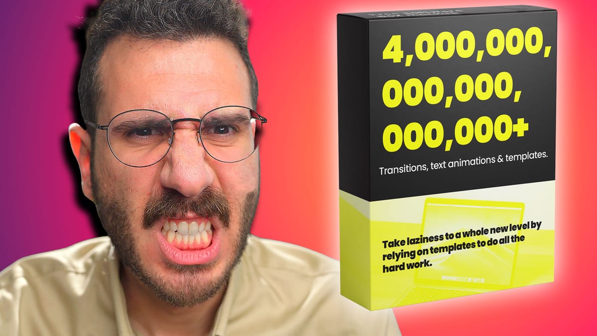
I Hate Video Editing Templates (But Here's How To Use Them The Smart Way)

Okay, let's be real. I see so many video editors online just throwing a bunch of templates together and calling it a day. I mean, c'mon guys! Motion Array and Envato Elements are great and all, but slapping some pre-made effects on your timeline doesn't actually make you a creative video editor.
And yeah, I know I sound like a grumpy old man, but hear me out. There's a reason I have pet peeves about templates, but I also think there's a smart way to use them to get better. Let's rant and then let's strategize. 😉
Why Video Templates Suck
- Templates make you a lazybones: It's like using canned laughter instead of writing good jokes. You skip the real skill development. The understanding of timing, pacing, and visual storytelling, and go for the easy fix.
- Everyone looks like everyone else: When you lean too hard on the same transitions everyone uses, you become Bob Ross with a video editor instead of a paintbrush – lots of "happy little accidents", but not much originality.
- Templates are the opposite of having your own voice: The whole point of being a creative professional is to…well…be creative. If you're just repackaging someone else's style, what's the point?
- Templates break your brain (by making it mushy): How are you going to grow those awesome problem-solving skills if you're constantly outsourcing the creative heavy lifting to a template?
The Nightmare of Updates and Bugs
Okay, enough about artistic integrity. Here's something truly infuriating: template updates breaking your workflow or, worse, your finished projects. Talk about a rage-inducing surprise when you go to reopen an old project!
Plus, have you ever used a template pack that just CHUGS in your software? It's like editing video on a dial-up modem!

Bonus annoyance: Templates break immersion
Picture this – your viewer is in the zone, totally vibing with your video, then BAM! They see the same whoosh transition they just saw on another channel yesterday. It's the equivalent of a bad jump cut. It jolts them out of the experience.
Alright, I'm Off My Soapbox. How to Use Templates The Smart Way

I'm not a total template hater, promise! Here's how to actually get some value out of them:
- Treat templates like training wheels: Use customizable templates in After Effects. Edit them, then export them as a ProRes file. Then it'll just be another video in timeline. No slow downs. No buggy plugins. You can even export as an animation file to retain transparency.
- Customization is KING: Tweak thecolors, adjust theeasing, change the fonts! Put your own spin on things so it doesn't feel so copy-paste.
- Make your own library: Once you start building custom effects and transitions, create your own template library. Then you can streamline your process AND offer unique visuals no one else has. (Bonus: You can sell them for extra $$!)
Real-World Examples of Going Beyond the Template
- Instead of a Zoom template, master it by hand: Yeah, it's a bit more work, but manually keyframing Zooms lets you finesse the speed, feel, and focus, which is totally worth it for client work.
- Custom pop-ups are CLIENT GOLD: Forget generic subscribe reminders! Designing unique pop-ups that match your client's brand is a guaranteed way to impress them.
Final Thought
Templates are a tool, not the be-all, end-all of creative video editing. Use them to learn and grow, not to replace your own creativity!
Okay, over to you! Do you love templates, hate them, or have a love/hate relationship? Share your hilarious template horror stories in the comments!
Let me know if you've built any awesome custom effects you're proud of. I wanna hear all the juicy details!


